How’s this for an ancient way to
visually capture a most enduring story?
visually capture a most enduring story?
The Columbia Icefield is about snow becoming ice, which melts into a river that runs into an ocean.
The Columbia River is about geography that ranges from mountains to foothills to grasslands and coastal areas.
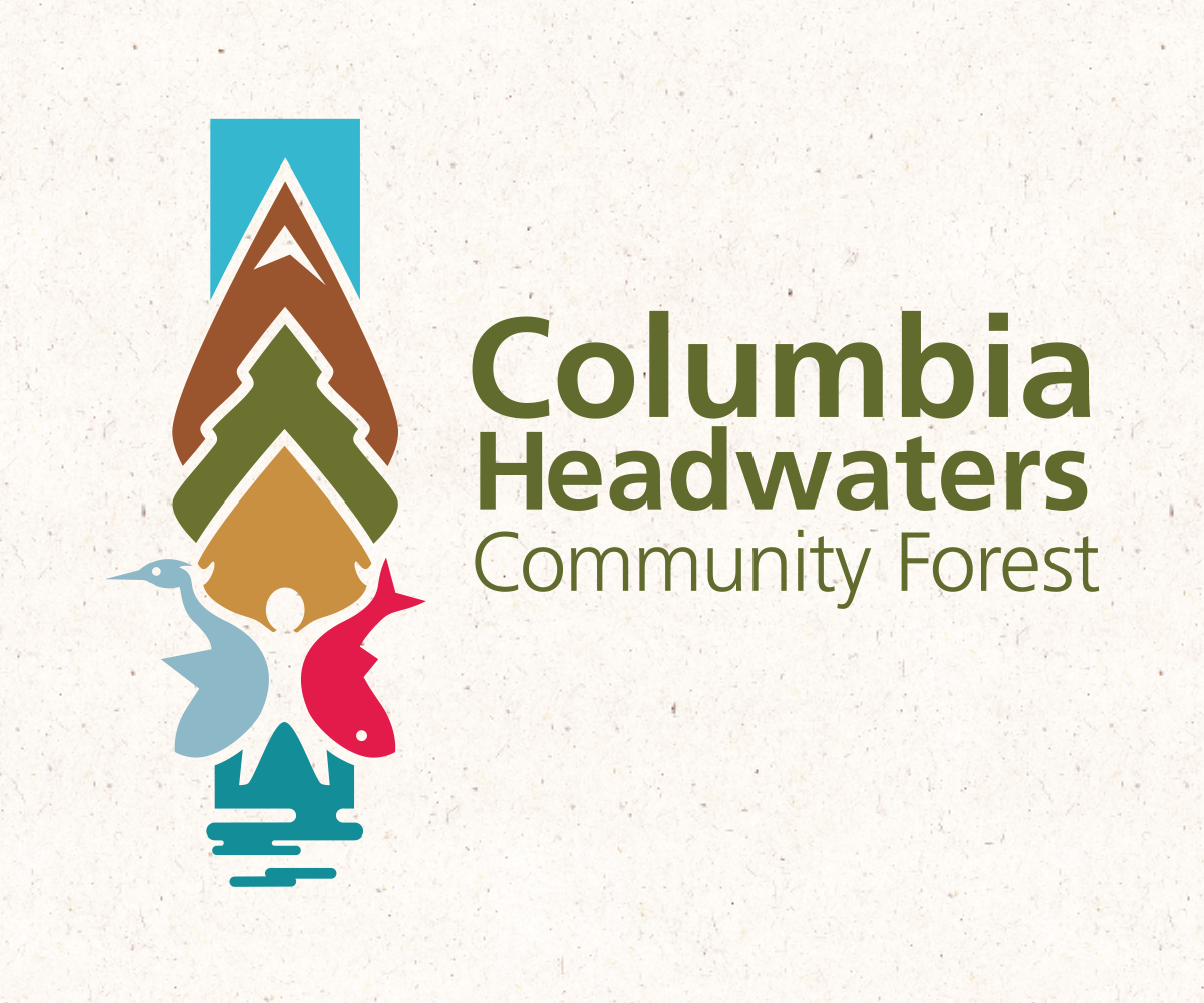
The Columbia Headwaters Community Forest is about the evolution of human endeavors along the banks of one of our mightiest rivers. And it’s complicated because you have competing economic activities, all of which must respect the needs of ecology.
Imagine trying to get these diverse interests to cooperate in any way, let alone visually. That Kirk managed such a feat is a testament to his persistence and his belief in the power of good design.
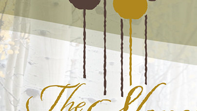
“Good design is exemplified in the totem poles carved by the indigenous people on the west coast,” said Kirk. “Their totems told marvelous stories in such a lovely, linear way, I just followed their lead.”
So his brand – his totem, for the Columbia Headwaters Community Forest, shows us how everything is interconnected: “from the clear blue skies above the mountains to the forests, farmlands and communities where fish, animals and humans share the river, the land and the sea”.
It’s so simple it’s elegant. So colourful, it’s friendly. And it’s a reminder that, sometimes, the old ways are the best ways.
Story by: George Roberts
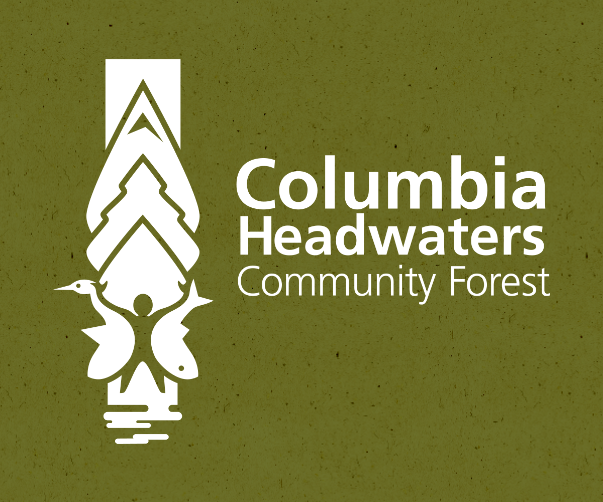
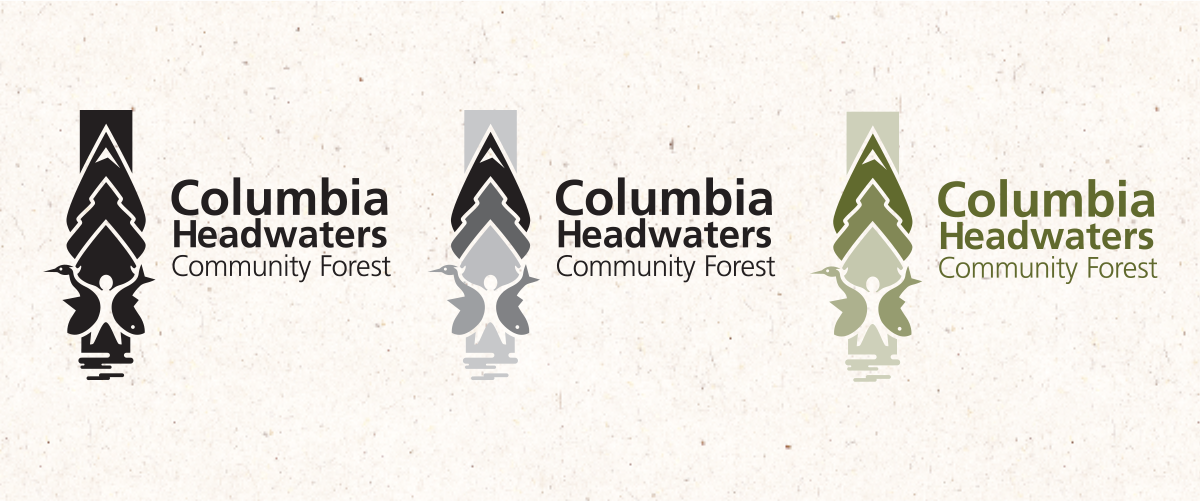
Brand Identity // Secondary usage – 100% black, grey scale and one colour spot PMS 575
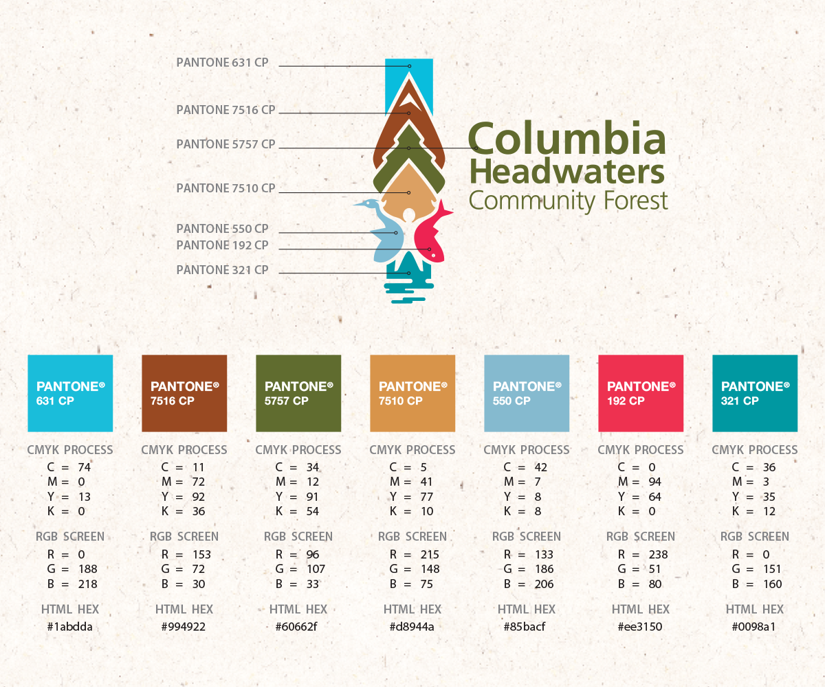
Brand Standards Guide // Brand identity colour breakdown for print and digital applications
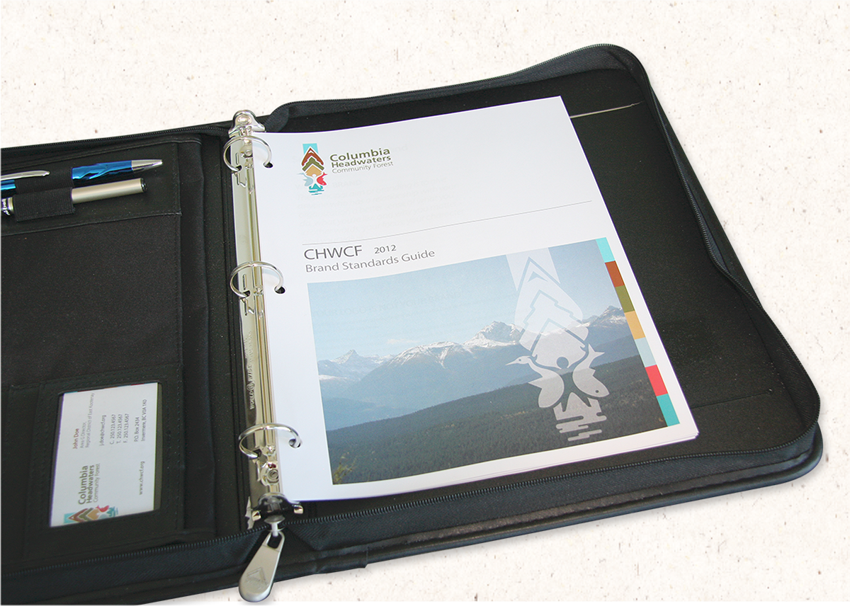
Brand Standards Guide // Simple 8.5" x 11" pages placed within a binder